


©2024
Client: Richard Franco Agency
Project: Brand Identity
Project: Brand Identity
Tradition & Progress Redefined
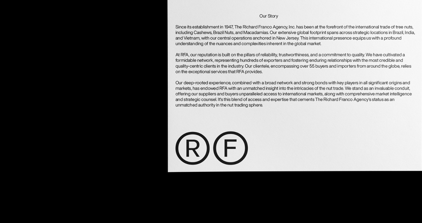
In the panorama of the global nut trade, the Richard Franco Agency (RFA) stands as a beacon of heritage and a byword for excellence. Steeped in tradition and driven by the unwavering pursuit of quality, RFA has built a name that is synonymous with trust and distinction. As we unfurl the pages of RFA’s brand story, we delve into a visual identity steeped in authority, elegance, and the enduring spirit of a company with roots firmly planted in the fertile grounds of its past but with focus on the future.
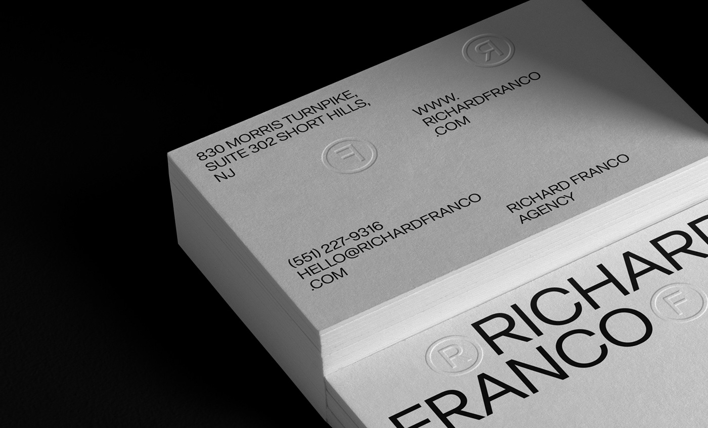
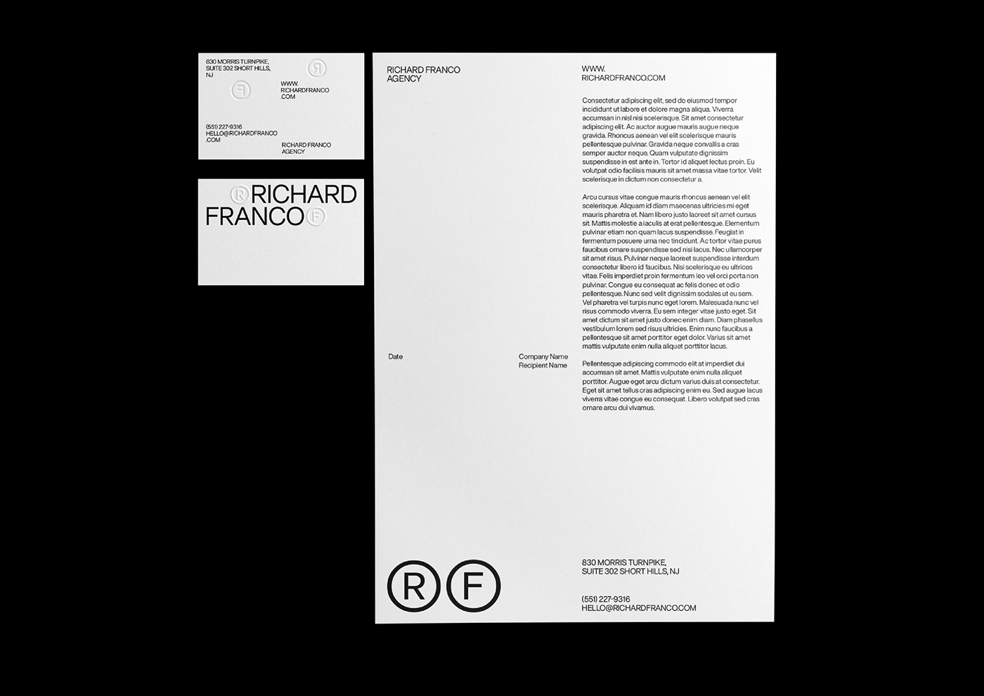
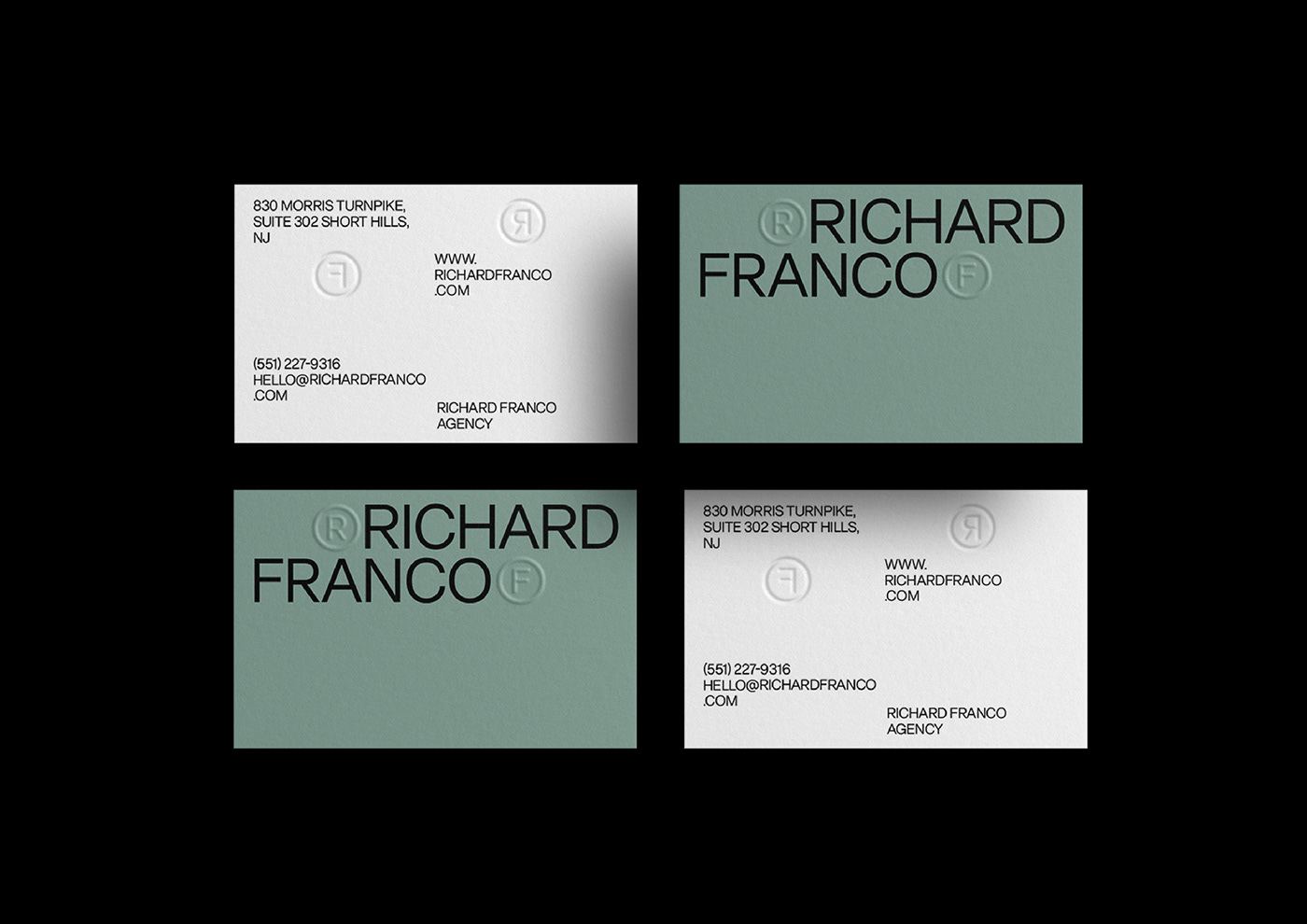
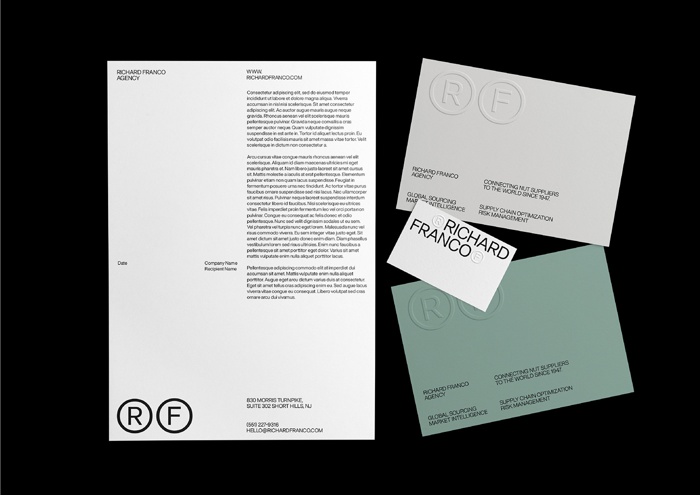
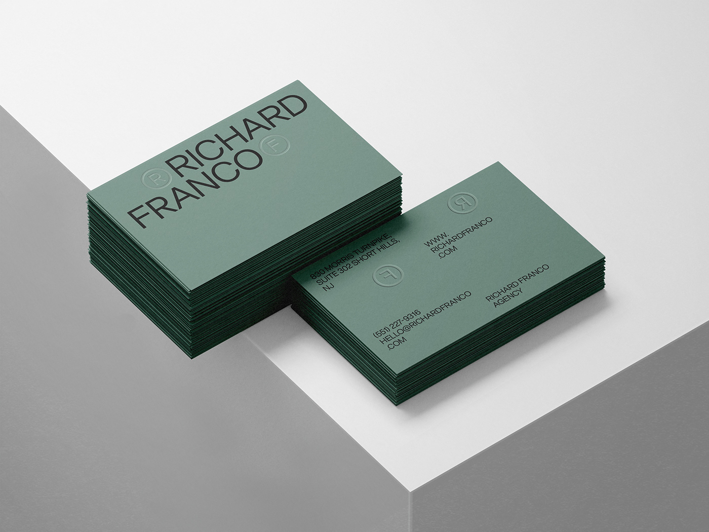
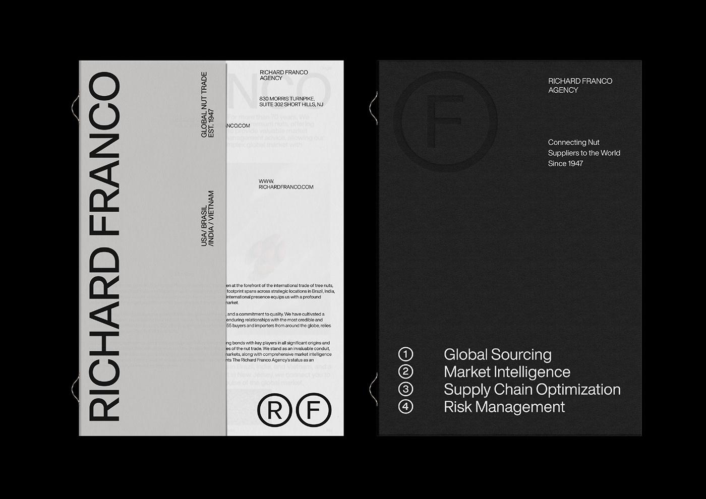
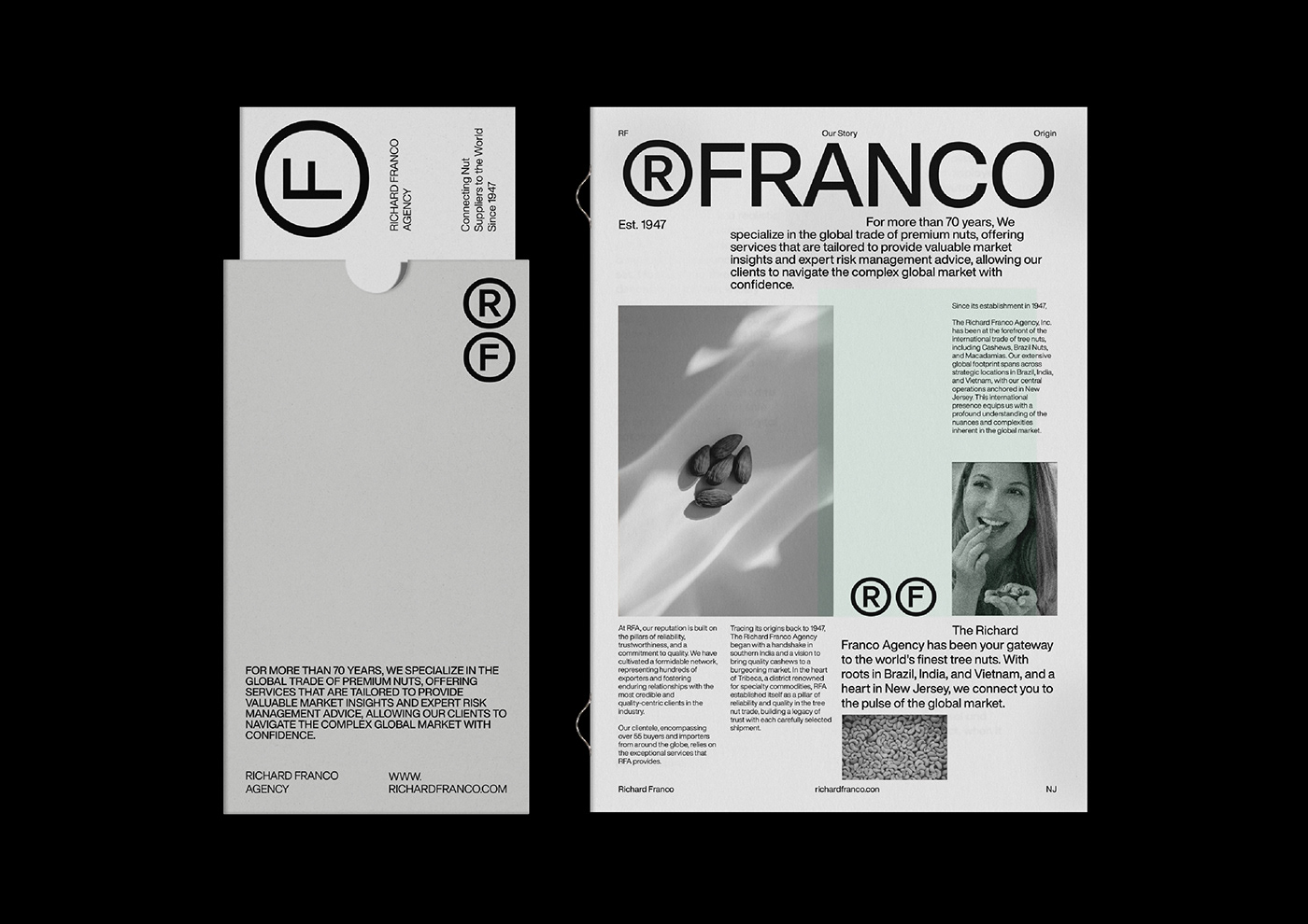
The rebirth of RFA’s brand identity as presented on this proposal is a harmonious blend of the old and the new in an intriguing typographic approach, a narrative that pa ys homage to the agency’s rich history while striding confidently into the future. The iconic initials 'R' and 'F' stand at the forefront of this transformation, reimagined to capture the essence of RFA’s commitment to authenticity and excellence. These are not mere letters but symbols, echoing the universal ®, that stand guard over the agency’s legacy of quality. Meticulously crafted, they echo the ® symbol, recognized worldwide as a standard of genuineness and protection, underscoring RFA's rightful place at the pinnacle of the industry.
The new visual identity of the Richard Franco Agency is a testament to the power of simplicity and timelessness in design, an aesthetic that achieves a unique and distinctive character without sacrificing sincerity. The clean lines and the grid based layout speak to the moral clarity and honesty at the heart of RFA's operations, mirroring their straightforward approach to business. This design choice is a deliberate nod to the company's commitment to integrity and transparency, assuring partners and clients alike of the genuine quality and reliability that RFA stands for. In an industry where complexity often clouds judgment, RFA's visual identity cuts through the noise, offering a beacon of trustworthiness and principled service.

Harmonizing Heritage with Modernity
RF
Conceptual Base
The RF Design Ethos
Our design concept marries tradition with innovation. The iconic 'R' and 'F'—the initials of Richard Franco—are re-envisioned as symbols that reflect the agency's authority and registered excellence in the industry. These letters are not merely characters; they are crafted to echo the ® symbol, universally recognized as a mark of authenticity and protection. This design choice is a testament to RFA's ownership of quality and trustworthiness in their field.
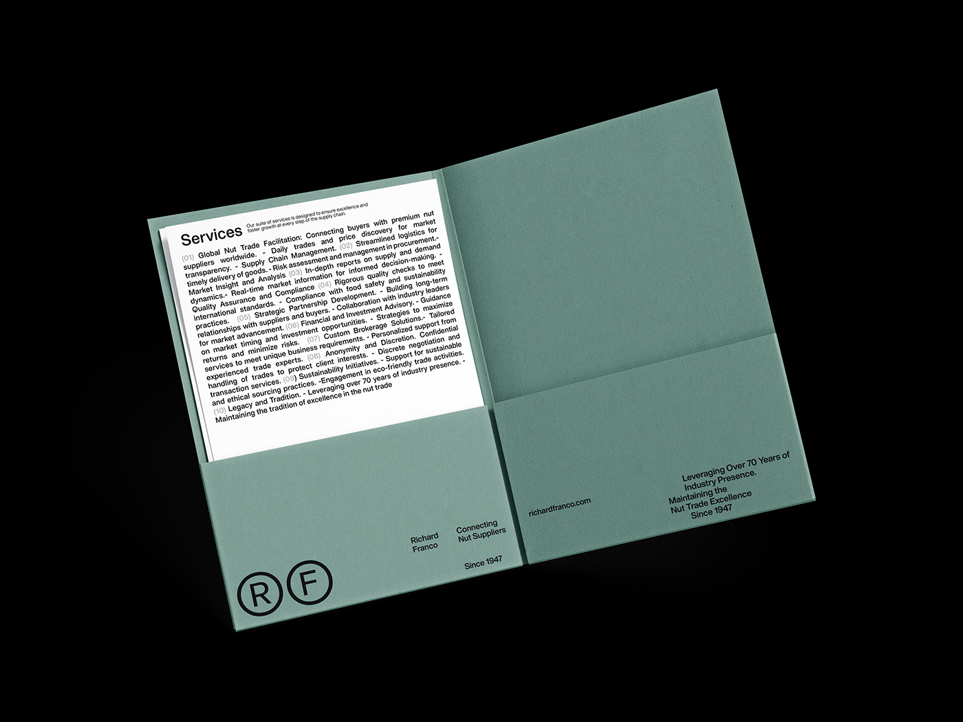
In the visual representation, the 'R' and 'F' stand within outlined circles, signifying completeness, unity, and the global reach of RFA. The outlined circles also resonate with the idea of a seal of approval, a guarantee of unmatched service and product excellence. By using these letters together, 'RF' becomes a mnemonic device, a symbol of the reliability and finesse that RFA brings to the global nut market.
In essence, the new brand identity is a bold step forward—a visual dialogue that speaks of RFA's dedication to being at the forefront of the industry while never losing sight of the values that have shaped their successful past. It is an identity crafted not just for the present, but to stand the test of time, much like the Richard Franco Agency itself.


Agency: Silver Spoon Agency
Creative Direction & Design: Dimitris Vanis


